When you choose a funeral director and go through all that’s involved in arranging a funeral you are allowing us into your lives at an incredibly emotional time. We feel it’s only right that you should know a little about us too.
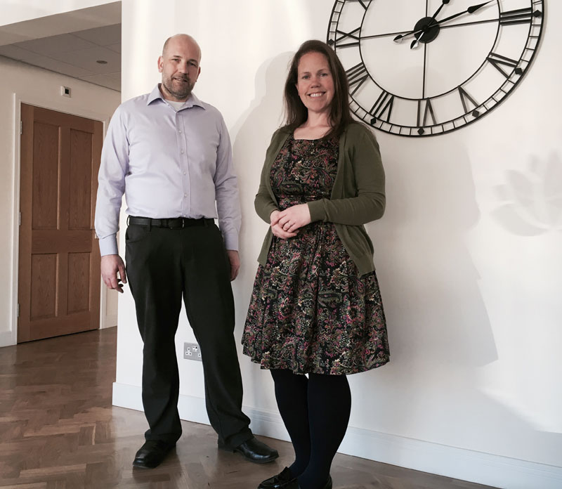
We are Robert and Karen Quinn, a brother and sister who are Wirral born and bred – we both love our Peninsula and are so glad we found a place in it’s heart where we could start the next chapter of our own journey. We are by no means new to the profession.
“What we do is not a job or a career choice it’s a way of life”
We were raised by parents who successfully began and grew their own independent funeral business. They both set a wonderful example instilling in us a strong moral compass to treat people as you wish to be treated; both in business and in life.
What we do is not a job or a career choice it’s a way of life; we have been involved all our lives and it’s what we remain passionate about – to provide an exemplary level of service for our families.
Covering but not limited to Heswall, Gayton, Irby, Pensby, Thingwall, Thurstaston, Brimstage, Barnston, Thornton Hough, Parkgate, Neston – wherever we are needed in Wirral and beyond.
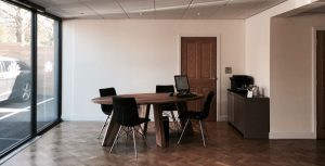
Our own business has been a long time in the planning but everything had to be just right before we could begin. We found the right place, in the perfect location but the property was far from perfect. However, following a comprehensive redevelopment, we now think it is – perhaps we are biased but we are both very proud of our premises. For more about the transformation of the former William & Benjamin florist click here.
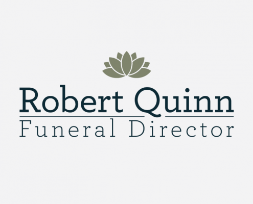
Our Logo
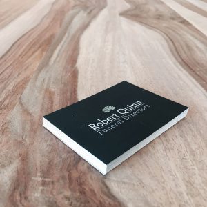
Our logo and branding was developed by local designer Edward Lamb of Dupe Creative. Here, Ed describes his approach to designing our logo:
“Working with Rob and Karen began with a conversation about the direction they saw for the business. They clearly wanted to differentiate themselves from other funeral directors in the area but I still needed to produce something that felt comforting, distinguished and not too flashy.”
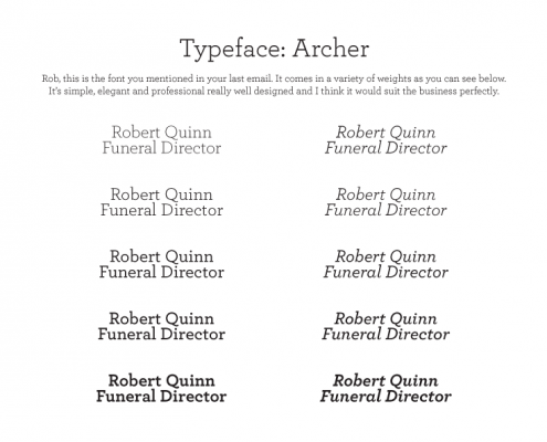
“My process involved choosing a typeface to represent the business (I chose Archer by Hoefler & Co.) then settling on some muted but stylish colours.”
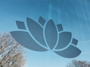
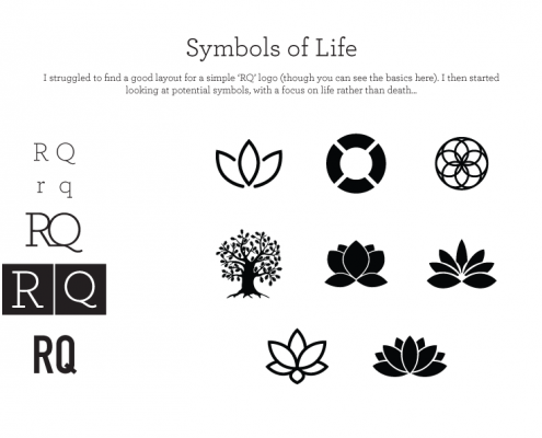
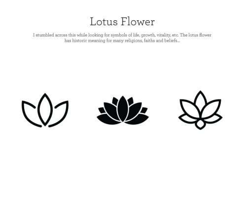
“Finally I thought long and hard about a symbol to sit along side the business name. For a while we were thinking that we wouldn’t have one, but I stumbled across the lotus flower when investigating life & death from a historic sense. The lotus flower is a symbol which has been used to represent life and vitality from thousands of years across many cultures so in the end it came about very organically.”
